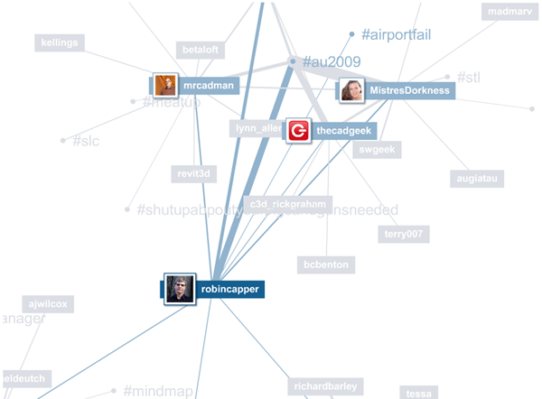
Twitter connections in a map
Regulars here will know I like the map format for visualising information relationships. Thus, it is interesting to see this summary of my Twitter activity and relationships. The static image below was captured not long after Autodesk University thus the #AU2009 tag featuring! It doesn’t convey the dynamics of the presentation but you can experience that by making your own by making a map at:
Mentionmap - apps.asterisq.com/mentionmap


