RobiNZ Blog makeover, tweaking my TypePad design templates
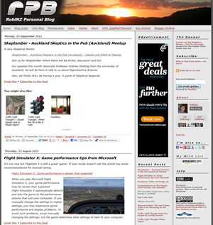
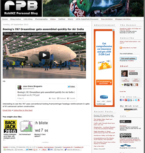
A while ago I decided it was time for a blog redesign. After considering lots of options, including radical change based on entirely new templates and a fun diversion, I have settled on some simple tweaks:
- Simplified Font: “Lucida Grande” Verdana replaces Arial — and no italics except for quoted text (from linked content).
- Simplified Sidebar: A lighter background, border and header font colours and some content revision to reduce clutter.
- Simplified Banner: Squared up logo and banner image panels with no more gradient transitions on the image(s).
Back to the future?
This squaring up may be slightly influenced by the Windows 8 look Microsoft no longer call Metro as I have been quite taken with that after playing with the preview. However it has some history as relates to my first image based banner from way back in 2004.
2004

2009-12

2012

No code was hurt in the making of this blog
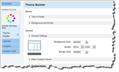
Although TypePad design templates (right) make this sort of change painless, no coding required, you can still spend quite a lot of time playing around.
Who sees it anyway?
Then I wonder, when so many read blogs via reader sites and applications which just consume the RSS Feed content does anybody actually still see or care about the site design?
Oh well, for my own records and amusement if nothing else:
http://rcd.typepad.com/ before & after
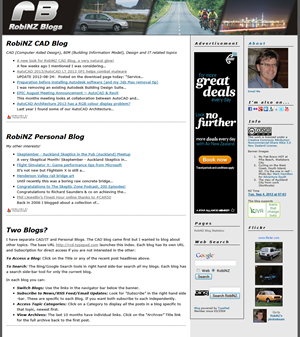
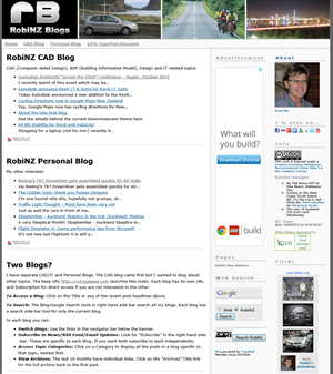
http://rcd.typepad.com/rcd/ before & after
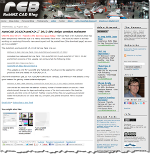
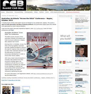
http://rcd.typepad.com/personal/ before & after
