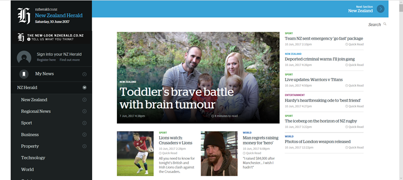
NZ Herald’s terrible new site
I just saw the “New” NZ Herald news website and filled out their “What do you think of the new design?” survey.
Comments in reply to: “Once the site is finalised and launched to the public, how likely is it that you would recommend the new NZ Herald website to a friend or colleague?” VERY UNLIKELY
- Site doesn't look like a professional news media site, looks like a blog with stolen Herald logos on it.
- I tried in Windows Edge and Chrome on an i5 13 inch HD screen hybrid machine, no browser add-ins or ad blockers
- Enormous sidebar menu an awful waste of space
- Sub menus are fiddly to navigate and not intuitive
- Response is awful, slow and the way it covers the site is terrible
- At normal browser scale (125%) article summary and body font too small (worse in Edge than Chrome)
- Sidebar menu should not scroll with main body
- Its scrolling is jumpy and out of time with main content. Visually distracting
- Astounded this is considered an improvement.
Response to “Any other comments”:
- Seriously, this needs a lot of work


