Now widescreen compatible
For too long I've had my blog main column set to "Fluid" which isn't ideal for predictable design or layout. This was because: I'm lazy I didn't have the custom code to adjust it to anything...
For too long I've had my blog main column set to "Fluid" which isn't ideal for predictable design or layout. This was because:
- I'm lazy
- I didn't have the custom code to adjust it to anything other than the 300,400,500 pixel fixed widths or Fluid settings in the TypePad template I use. I suspect that was designed around 800 pixel screens but who uses them any more?
- See 1.
500 was too narrow for me so "Fluid" it was. It was OK for most but on really wide screens some posts "fluided" to a very long single line!
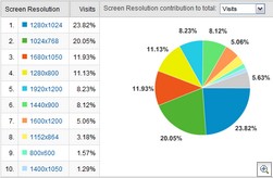
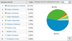
Today I was given the CSS code and since few, actually 1.57%, use 800 wide screens I've settled on a fixed 1100 pixel overall width. The most common size is 1280x1024. That's lower than I'd have guessed and I was also interested to see IE/Windows still dominates visits. Not what I'd expect on a "techie blog".


I've actually always sized my images to work at 500px, thus the extensive use of thumbnails, but if you encounter any readability problems with this new layout leave a comment. The only problem I foresee is the demand for even wider, thin images to use on the wider banner image I haven't done yet!


