Design productivity secrets from "Google User Experience", and a flaw in their UX?
“UX is an acronym for "user experience." but many of the principles discussed apply to all design projects. ChangeOrder: Secrets of UX Design Productivity from Google Last Thursday, I attended a...

“UX is an acronym for User experience" but many of the principles discussed in this ChangeOrder post apply to all design projects, especially the tips about design presentations.
ChangeOrder: Secrets of UX Design Productivity from Google
Last Thursday, I attended a free session organized by SIGCHI, Puget Sound region at Google Seattle HQ. Jake Knapp, a very well-spoken user interface designer, entertained a packed house with a speech on 17 tactics that he uses for creating strong UX work in "the flood" of projects that pour through his UX department from month to month…
Via swissmiss
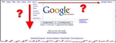
As a Google user, isn’t everyone on the net?, I have pondered one aspect of their Homepage (it’s even seen in the ChangeOrder Post!). While I understand their drive for simplicity it would be nice if the menu could sense, and cope with, a wider screen. Flying out a menu when there’s ample space for it’s contents doesn’t enhance my Google UX!